Paid traffic is getting more expensive, and B2B SaaS landing page conversion rates still average just 1-3% across most industries in 2025 – 2026. That means if your message isn’t clear in the first few seconds, you’re paying for attention you never convert.
This is exactly why SaaS One Pager Examples matter. A strong one pager distills your positioning, proof, and product value into a single, focused page that turns curiosity into demos instead of confusion.
That’s why this article breaks down 5 real SaaS one pager examples and 11 practical steps you can apply to build one that actually drives qualified action.
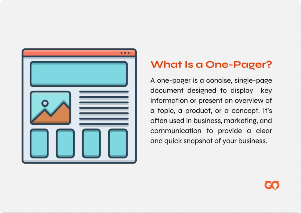
What Is a One Pager?
A SaaS one pager is a single-page document that gives a quick, clear overview of your software product. It typically includes your value proposition, core features, customer benefits, and a strong call to action—all condensed into a clean, visual layout.
It’s like an elevator pitch, but visual. Instead of talking through your product in 30 seconds, you show it—on one page.
Why One Pagers Work:
-
Easy to scan and understand quickly
-
Ideal for investors, potential customers, or demo follow-ups
-
Helps convert interest into action without overwhelming the reader
If you want to dive deeper into how to market a SaaS product, check out our comprehensive guide.
5 Effective SaaS One Pager Examples
1. SaaS Product One Pager Template by Visme
This one pager leans toward a clean, traditional layout, ideal for SaaS startups that want something simple, professional, and ready to share as a PDF or slide. It’s a strong choice for quick product overviews, especially in early investor conversations or product launches.
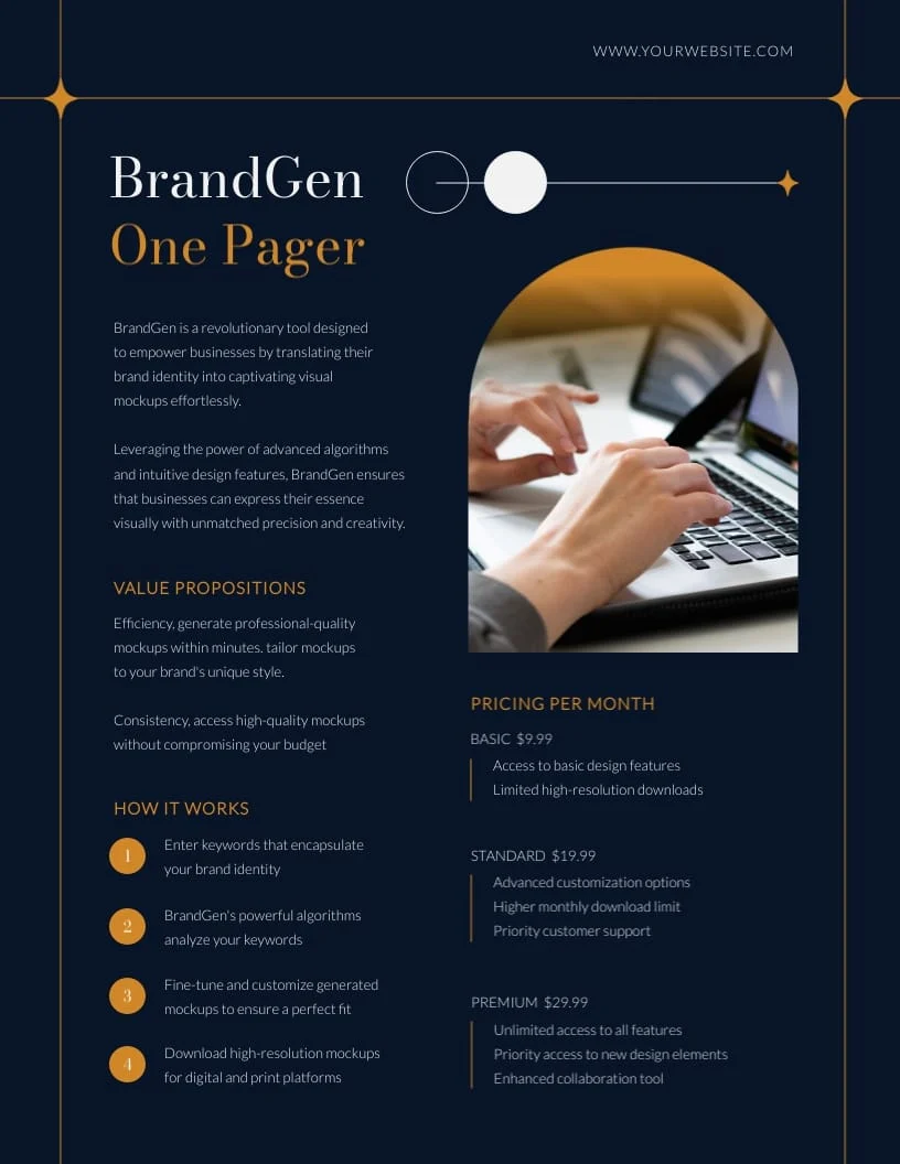
What I like about this one pager:
-
Balanced Layout: Combines headline, feature highlights, charts, and team bios without feeling cluttered.
-
Easy to Customize: Drag-and-drop editor makes it fast to edit logos, colors, or sections.
-
Professional Look: The use of icons, structured text, and soft color palette feels modern and polished.
-
Print-Ready Format: Ideal for sharing as an email attachment or pitch collateral.
Rooms for improvement:
-
Less Dynamic: Compared to interactive formats, it’s more static.
-
Stock Images: Some visuals are generic by default—should be replaced for authenticity.
-
Limited CTA Variation: CTA area is basic; could be more action-driven or personalized.
|
Category |
Analysis |
|
Example |
SaaS Product One Pager Template by Visme |
|
ICP Fit |
Early-stage B2B SaaS founders, pre-seed to Series A, products with clear and simple value propositions |
|
Funnel Stage |
Top-of-funnel awareness, early consideration, investor outreach |
|
CTA Type |
Single primary CTA such as Book Demo, Contact, or Learn More |
|
Traffic Source Fit |
Strong for outbound email, LinkedIn outreach, investor conversations, demo follow-ups. Weak for SEO and paid acquisition |
|
Ideal SaaS Stage |
MVP validation, early traction, fundraising stage |
|
Strength |
Clear linear narrative, easy to share as PDF, low cognitive load, fast comprehension |
|
Limitation |
Limited objection handling, static format, not suitable for inbound traffic or scaled paid campaigns |
Here is your template link.
2. Interactive SaaS One Pager by Storydoc
This one pager stands out by using a slide-based, interactive layout that feels more like a guided experience than a static PDF. It’s ideal for SaaS products that want to highlight multiple aspects—like features, use cases, and team—without overwhelming the reader on a single screen.
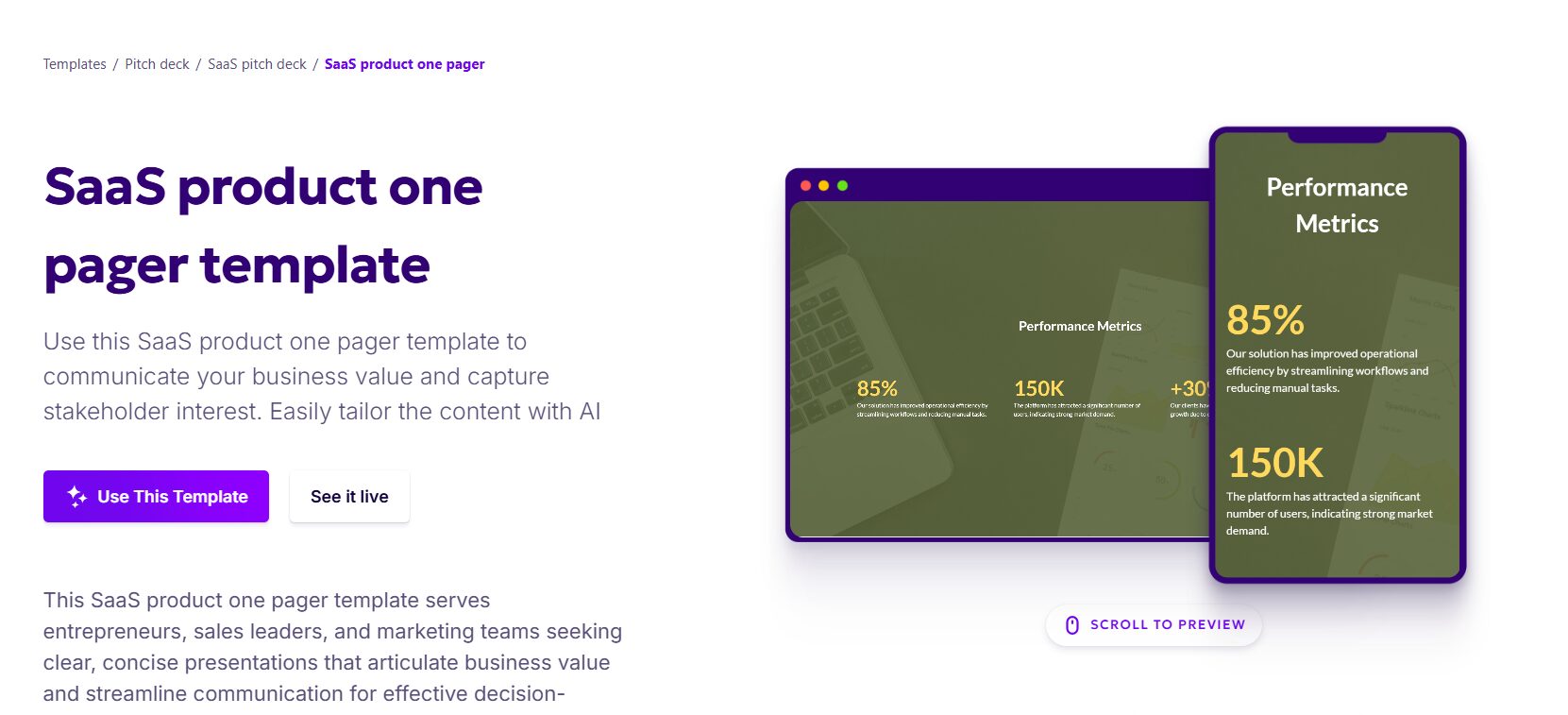
What I like about this one pager:
-
Interactive Flow: Each section is a separate scrollable slide, making the journey smooth and engaging.
-
Modular Content Blocks: Easy to plug in your own messaging using pre-set sections like “Problem,” “Solution,” “KPIs,” and “Timeline.”
-
Mobile-Optimized: Looks great on any device, which is crucial for busy stakeholders.
-
Integrated Media: You can embed video demos or product screenshots directly in-line.
Rooms for improvement:
-
Branding Flexibility: Customization is a bit limited if you have a highly specific brand style.
-
Requires Signup: To fully use or edit, users need to create an account.
-
Less Suitable for Print: Because it’s interactive, it’s better for digital viewing than as a traditional one-sheet.
|
Category |
Analysis |
|
Example |
Interactive SaaS One Pager by Storydoc |
|
ICP Fit |
Growth-stage B2B SaaS, products with multiple use cases, founders targeting modern digital buyers |
|
Funnel Stage |
Mid-funnel consideration, qualified lead nurturing, outbound follow-up after initial interest |
|
CTA Type |
Contextual CTAs embedded throughout slides such as Book Demo, Watch Demo, Explore Features |
|
Traffic Source Fit |
Strong for outbound links, sales follow-up emails, LinkedIn prospecting, and paid traffic to gated experiences. Moderate for SEO depending on indexability |
|
Ideal SaaS Stage |
Post-product-market fit, early scaling phase, building structured sales enablement assets |
|
Strength |
Guided narrative flow, interactive engagement, supports multimedia, reduces information overload by segmenting content |
|
Limitation |
Limited brand customization, requires platform signup, not ideal for print or offline sharing |
Here is your template link.
3. Business one pager
This business one pager template is also a fine example, it effectively presents key information in a structured, visually appealing format. It’s ideal for delivering clear, concise data points that are important for potential users to understand quickly.
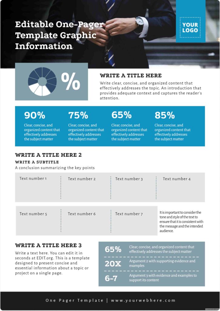
What I like about this one-pager:
-
Clear Structure: The template is well-organized with labeled sections, making it easy to navigate and fill out.
-
Concise Design: The use of percentages and bullet points helps deliver key information quickly without overwhelming the reader.
-
Interactivity: The link to EDIT.org allows users to easily customize the template in real-time, adding convenience for those who want to personalize it.
-
Data Visualization: The pie chart and statistics create a visual impact that makes the data more digestible.
Rooms for improvement:
-
Vague Instructions: The text like “Write clear, concise, and organized content” could be more specific to guide users on what exactly to write.
-
Too Many Empty Spaces: The template includes several empty text boxes that could confuse users or leave them unsure about what to put in each section.
-
Lacks Examples: Adding sample text or real examples could help users understand how to fill out the sections effectively.
-
Minimal Visual Appeal: The design feels a bit plain and could use some more color or imagery to make it visually stand out and engaging.
|
Category |
Analysis |
|
Example |
Business One Pager Template (EDIT.org) |
|
ICP Fit |
Small B2B SaaS teams, service-based SaaS hybrids, early-stage founders needing structured summaries |
|
Funnel Stage |
Top-of-funnel awareness, introductory outreach, early qualification |
|
CTA Type |
Basic CTA placement, typically Contact Us or Learn More |
|
Traffic Source Fit |
Suitable for outbound sharing, email attachments, internal presentations. Weak for SEO and paid traffic conversion |
|
Ideal SaaS Stage |
Early-stage validation, internal strategy alignment, simple product positioning |
|
Strength |
Structured layout, quick data visualization, easy customization, concise presentation of metrics |
|
Limitation |
Generic guidance, lacks persuasive depth, minimal emotional pull, not optimized for conversion performance |
4. IT service one pager
This one pager by Deline is ideal for SaaS, especially in the security and compliance sector, because it highlights the importance of building trust, which is critical in B2B relationships. It effectively combines data and visuals to explain why trust matters in business.
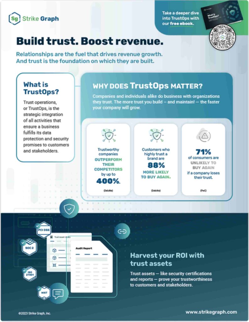
What I like about this one-pager:
-
Compelling Headline: “Build trust. Boost revenue.” is straightforward and grabs attention.
-
Clear Explanation: The “What is TrustOps?” section defines it in simple terms, making it easy for readers to understand.
-
Strong Visuals: The icons and stats are effective in conveying key points like the 400% performance boost and 88% likelihood of repeat purchases.
-
Data-Driven: The stats and graphs provide credibility and help support the claims made about TrustOps.
-
Call to Action: The QR code leading to the ebook is a smart, interactive way to engage readers and encourage further exploration.
Rooms for improvement:
-
Text Overload: The text-heavy areas like the description of TrustOps could be more concise. Shorter sentences or bullet points might improve readability.
-
Lack of Testimonials: Adding customer quotes or success stories would make the claims more convincing.
-
Visual Balance: While the design is clean, the lower section could use a bit more spacing to avoid the crowded feel with all the icons at the bottom.
|
Category |
Analysis |
|
Example |
IT Service One Pager by Deline (Trust-focused SaaS format) |
|
ICP Fit |
B2B SaaS in security, compliance, infrastructure, enterprise IT solutions |
|
Funnel Stage |
Mid-to-bottom funnel, decision-stage validation, enterprise procurement support |
|
CTA Type |
Secondary CTA such as Download Ebook, Learn More, Book Consultation |
|
Traffic Source Fit |
Strong for outbound enterprise outreach, conference collateral, sales enablement. Moderate for paid traffic if adapted to web format |
|
Ideal SaaS Stage |
Growth-stage to enterprise SaaS, established product with compliance positioning |
|
Strength |
Trust-centric messaging, data-backed credibility, strong headline clarity, aligns well with risk-sensitive buyers |
|
Limitation |
Text density reduces readability, limited testimonial depth, visual balance could impact scanning efficiency |
5. SaaS one pager/landing page
It’s modern. It’s simple. It works!
Although it’s basically a simple landing page, the reason I personally like this design is because it nails the essentials, the principles of a well-designed one pager—minimal text, powerful visuals, and a clear, direct message. It’s straightforward without unnecessary fluff, making it easy to follow while still looking sleek and professional.
What I like about this landing page:
-
Clean & Simple Design: The minimalist design makes it easy to navigate and doesn’t overwhelm the visitor with too much information.
-
Clear Messaging: Phrases like “The last project management tool you’ll ever need” immediately communicate the app’s value proposition.
-
Strong Call to Action: The “Get Started” button is prominent and encourages immediate action from users.
-
Visual Appeal: The simple yet effective use of icons and illustrations highlights key features and functions, without making the page feel cluttered.
-
Engaging Tone: The casual, humorous headline like “Fire your project managers, you don’t need them anymore” adds personality and makes the page feel approachable.
Rooms for improvement:
-
Lorem Ipsum: Placeholder text in some sections weakens the message. Real, engaging content would make the page more impactful.
-
Lack of Social Proof: Adding testimonials or user success stories could add credibility and help visitors trust the product.
-
Too Much Focus on Features: While it’s good to highlight features, balancing it with customer pain points would make the value proposition stronger.
-
Overuse of Large Text: While big text is great for impact, some sections could benefit from a more balanced design with smaller text for variety and clarity.
| Category | Analysis |
|---|---|
| Example | SaaS One Pager / Landing Page (Minimalist Web Format) |
| ICP Fit | Product-led SaaS, SMB-focused tools, project management or productivity apps targeting non-technical buyers |
| Funnel Stage | Top-of-funnel to mid-funnel acquisition, direct response landing page for trial signups |
| CTA Type | Primary action-driven CTA such as Get Started or Start Free Trial |
| Traffic Source Fit | Strong for paid ads, product-led growth funnels, branded search. Moderate for SEO depending on content depth |
| Ideal SaaS Stage | Post-MVP, scaling acquisition, optimizing trial-to-paid conversion |
| Strength | Clear value proposition, low cognitive load, strong visual hierarchy, effective for quick decision-making |
| Limitation | Limited social proof, feature-heavy messaging, weak objection handling, needs deeper credibility for enterprise buyers |
For SaaS founders looking to move beyond one pagers and develop a full marketing strategy, check out our Ultimate B2B SaaS Marketing Plan Template for actionable steps and downloadable resources
11 Steps to Create an Effective One Pager for SaaS
Creating a high-converting SaaS one pager takes a balance of clear messaging and thoughtful design. It should instantly communicate your product’s value, address pain points, and prompt action — all on a single, scannable page.
Here’s how to do it:
1. Content That Resonates
Your content needs to connect immediately. If your audience doesn’t “get it” in seconds, they’ll move on.
Step 1. Start with a Clear Value Proposition
Your value prop is the heart of your one pager — one strong, benefit-driven sentence.
- Weak: “Our platform offers advanced data analytics.”
- Strong: “Unlock hidden insights and drive business growth with our advanced data analytics platform.”
Step 2. Identify and Address Your Audience
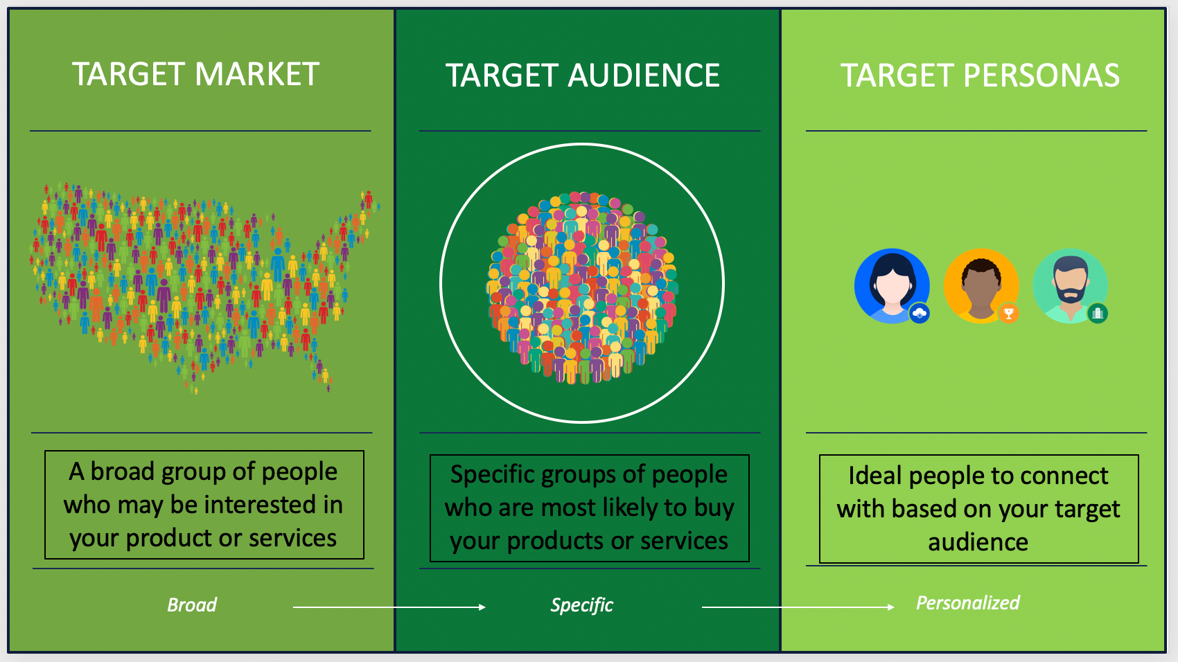
Always be specific about your cilents (source: Search Engine Journal)
Be specific about who you’re talking to. A general message won’t land.
-
Example: “We help small eCommerce teams with fewer than 20 employees.”
-
Use persona-based language, and validate it with real user feedback.
Step 3. Highlight Their Pain Points (and Solve Them)
Your audience doesn’t care about your product—they care about solving their own problems. Show that you understand their struggles better than anyone.
Instead of “inefficiency,” say “You’re spending hours a week tracking inventory manually.”
Remember to position your SaaS not just as a tool, but as a solution that delivers tangible benefits and fixes for their day-to-day challenges.
Step 4. Focus on Unique Solutions with Tangible Outcomes
Once you’ve hooked them with empathy, it’s time to demonstrate how your SaaS delivers concrete, measurable results. Don’t just say you help — prove it.
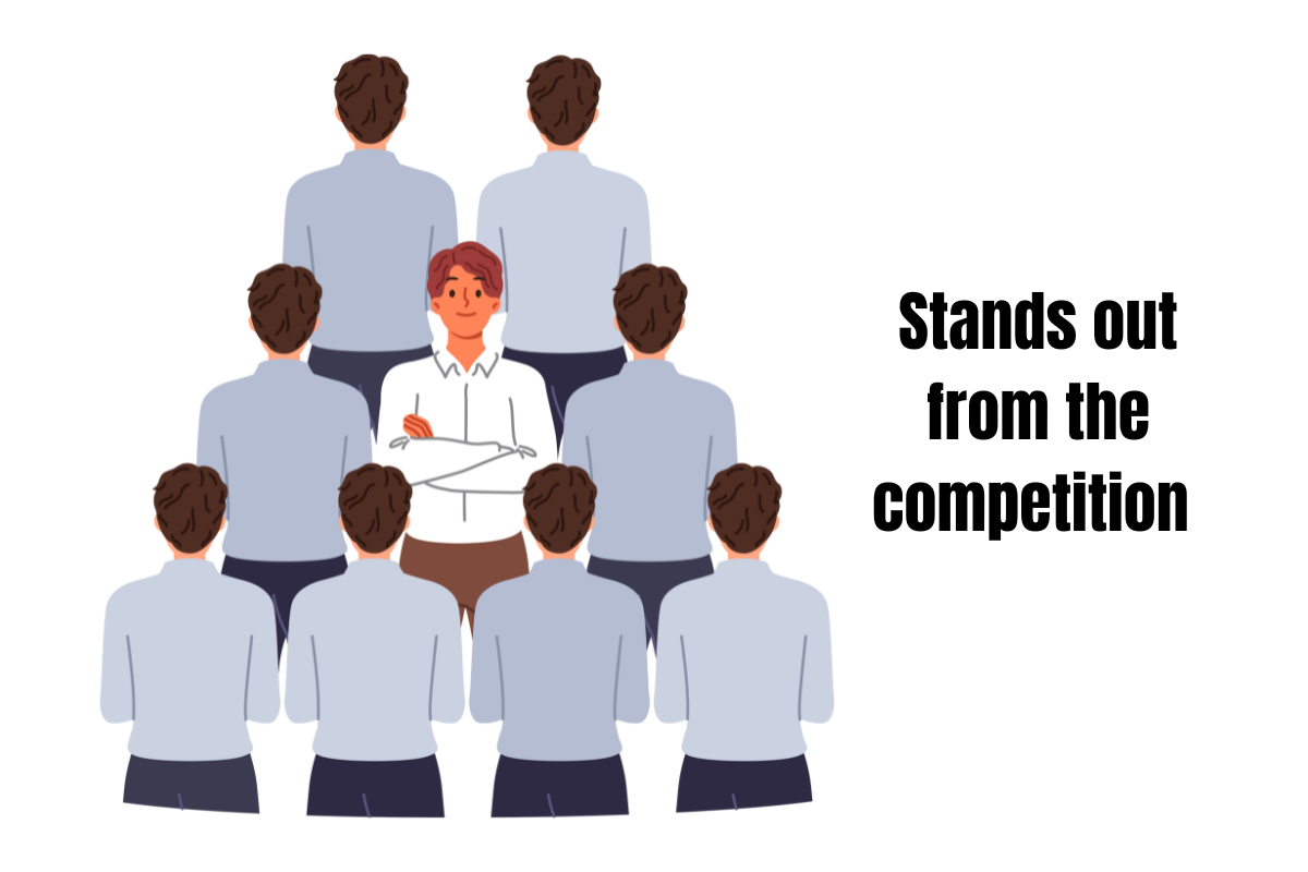
Let customers know what sets you apart from the rest
Why It’s Required:
- Differentiation: Your readers need to know exactly how yours stands out from the competition and, more importantly, why it’s the best fit for them. Avoid generic claims like “our solution is easy to use.” Be specific: “You can set up our software in under 15 minutes, without technical expertise.“
- Credibility: Backing up your claims with statistics, case studies, or real-world examples adds weight and credibility, showing you can deliver on your promises.
Step 5. Keep Features Benefit-Oriented
Your users don’t just want to see what your product does — they want to know how it helps them. Listing features without context often leads to confusion or disinterest.
To make each feature meaningful, tie it directly to a benefit or outcome. This helps your audience quickly imagine how your product fits into their workflow.
Use this simple format: Feature → Benefit
Example:
“Automated reporting” → “Get real-time insights to adjust your strategies on the fly.”
Bullet points work great here. Make each one feel like a mini win for the reader.
Step 6. Build Trust (Fast!)
“If you see a brand and it doesn’t look trustworthy, do you think you’ll ever buy anything from that business?”
– Scott Adam Lancaster, Founder of Lancaster & Co
Social proof is one of the strongest psychological triggers to convince someone to take action. When potential customers see that others have successfully used your product, it builds confidence that they will have a positive experience too.
Include proof points—whether it’s testimonials, awards, case studies, or well-known client logos. Keep this section concise but impactful. Add a single strong testimonial or a quick case study. For instance, “After using our tool, [Client X] increased productivity by 30% in 3 months.”
For more on building an effective content strategy for SaaS, see our in-depth article.
2. Design That Delivers
Design is just as important as the content. If your one pager isn’t visually appealing or easy to follow, your audience will lose interest—no matter how compelling the message. Here’s why each design element matters:
Step 1: Structure for Easy Reading
Most readers will skim, not read. So make your layout clean and predictable. Break content into 3–4 blocks with clear headings and logical flow.
A simple grid keeps everything aligned. Avoid clutter — let sections breathe. If your page feels crowded, your message will get lost.
Step 2: Prioritize with Visual Hierarchy
Visual hierarchy ensures that the most important information grabs attention first. If your main points don’t stand out, you risk burying key messages in a sea of text. Using font size, bold text, and layout techniques, you can direct the reader’s attention to the crucial points, such as benefits or the call-to-action (CTA).
- Use larger font sizes for headlines and subheads, and bold key points for emphasis.
- Keep the body text readable, but secondary, at 10-12 points.
This ensures they don’t miss what’s most important. If your key points are buried under excessive content or poorly laid out, readers will likely give up before they reach the CTA.
Step 3: Use Relevant Visuals (Don’t Overload)
Visuals enhance your message but must serve a purpose. Irrelevant or excessive imagery can detract from your core message and confuse the reader.
Why It’s Required:
- Clarity through Illustration: Showing product screenshots or relevant visuals helps explain complex features or demonstrate how your SaaS works in action.
- Engagement: People process visuals faster than text. Relevant images or icons can enhance understanding and keep the reader interested without overwhelming them with words.
Step 4: Stick to a Clean Color Scheme
Too many colors can overwhelm and feel unprofessional. Limit your palette to 2–3 brand colors used consistently.
Use color to highlight actions or important info — not just for decoration. Neutral backgrounds + bold accents often work best.
Step 5: Whitespace Is Your Friend
Whitespace, or the lack of content between sections, images, and text blocks, helps reduce cognitive load and makes your one-pager feel balanced.
I know what you’re thinking, “One-pager is supposed to showcase everything. Leave generous space between sections and images to make your content more digestible.
Final Touch: Action-Driven Call-to-Action (CTA)
The CTA is arguably the most important part of your one pager. You can have great content and design, but if your CTA isn’t strong, the reader might not take action.
Why It’s Required:
- Direct Next Steps: A CTA tells your audience exactly what you want them to do next, such as “Start a Free Trial” or “Request a Demo.” Without it, they’re left with no clear path forward.
- Increased Conversions: A well-designed, action-oriented CTA is the final nudge that converts an interested reader into an active lead. It should be visually distinct and use compelling language to encourage immediate action.
Pitch Deck or One Pager: Which Works Best For Investors Outreach?
In the setting of a cold outreach, a one pager with concise bullet points is highly effective. It offers a clear, brief overview of your business, making it easy for potential investors to quickly understand the key aspects of your SaaS product. This approach increases the likelihood of securing further interest without overwhelming them with too much information upfront.
For in-person presentations, however, a pitch deck is more appropriate. It allows for a more detailed exploration of your business, typically consisting of 10-15 pages that provide a structured narrative of key data, financial projections, and strategic insights. The pitch deck supports your in-person discussion, helping to clarify and reinforce your main points while addressing potential investor questions.
In summary:
- Cold Outreach: A one pager with key bullet points for clarity and brevity.
- In-Person Presentation: A pitch deck for a more detailed and engaging business presentation.
Conclusion
The right SaaS One Pager Examples is more than just about a clean design. It shows how positioning, proof, and structure work together to drive action. If demo rates are flat, the issue is usually clarity. The value proposition may be vague, objections unanswered, or the page trying to say too much.
At Golden Owl Digital, we usually step in when traffic looks healthy but conversions don’t move. That’s often a positioning and structure issue instead of a traffic problem. If you’re reworking your own page, start there. And if you want an experienced team to pressure-test it from a revenue perspective, that’s exactly where we tend to add the most value.